
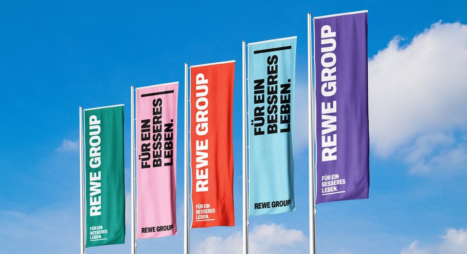
As a co-operative, we have strong foundations and always keep the next generation in mind. The new corporate identity highlights what sets us apart: the strength of our community.
The REWE GROUP is constantly evolving. New business segments are emerging, and new forms of collaboration now shape our day-to-day work. Our new corporate identity reflects this change: clearer, more flexible and more contemporary.
With our new corporate design, we are creating a modernised, unified identity for our diverse group of companies. It gives us an image that reflects who we are today – not as the sum of our individual parts, but as one large, strong community.
Lionel Souque, CEO of the REWE GROUP: “Almost 100 years of the REWE GROUP show that it is not just good ideas or successful business models that drive us forward. It is the attitude with which people here take on responsibility, stand up for one another and make a difference together. Our new mission statement translates this attitude into the present day and gives us a shared promise: we work for a better life – together, in a cooperative spirit and with an eye to future generations. For me, this mission statement becomes powerful when each and every one of us can say: ‘I recognise myself in this – and I act accordingly.’”
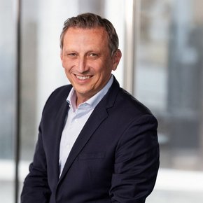
„We work to create a better life – together, as a cooperative, and with an eye to future generations.“Lionel Souque, CEO of the REWE GROUP
This foundation is reflected in our new design. With REWE, we all carry a strong name. In the previous logo, the word ‘Group’ took a back seat to ‘REWE’. In the new logo, both words stand side by side on an equal footing. This highlights what sets the REWE GROUP apart today: the strength of our community, made up of many people and business segments across 21 countries, who together achieve more than any single part could on its own.
‘For many of us, the REWE GROUP is more than just a company: it is a piece of home – sustained by people who take responsibility, work together and shape the future. Our new corporate design gives a face to this special sense of togetherness. It connects our roots with our new beginning and highlights what makes us strong: our diversity, our solidarity and our shared commitment to creating a better life for generations to come,” says Ines Juen, Director of Corporate Communications at the REWE GROUP.
For some, the REWE GROUP is their “primary residence”; for others, their “second home”. But no matter where our home is, we are connected and stand up for one another. Our new logo therefore does not just show who is speaking here. It also makes clear what we stand for: solidarity, equality and the power of community.
What defines us as a company is deeply rooted in our history. That is why we have drawn on our historical roots for our new design. The design elements build on our heritage and translate defining features into a modern visual language. This makes the design distinctive and ensures that the REWE GROUP is clearly recognisable as the source.
Our new design is an expression of what the REWE GROUP stands for: diversity, pragmatism and a creative spirit. An expanded colour system, new design elements and flexible applications create scope for different stories, perspectives and occasions. It also meets the requirements of modern corporate communication in line with current standards. The new design supports accessible communication and lays the foundation for a consistent presentation across all channels.
Above all, however, the new corporate design is intended to make day-to-day work easier. New templates, assets and clear guidelines help to create content more quickly, easily and consistently. This provides clarity and strengthens the impact of our communication both internally and externally.
The roll-out is being carried out deliberately in stages. In many places, the new and existing designs will initially be seen side by side. In this way, we ensure that the transition is pragmatic, cost-effective and focused on sustainability. With every further application, the new visual identity becomes more visible and increasingly shapes the image of the REWE GROUP.
The new corporate design is therefore not just about communication or marketing. It is brought to life by all of us – the people who use it every day. Every presentation, every publication, every photograph and every application helps to make the REWE GROUP recognisable for what it is: a strong community.